Representing Data Graphically
Introduction
What you’ll learn to do: Utilize methods for visualizing data
The following video provides many examples of how contextualized, visually beautiful numbers add meaning and relevance to our life. Watch the first three minutes to get a flavor for data visualization. https://youtu.be/5Zg-C8AAIGg In this section, we'll explore how to make information meaningful in a visual format. We will present some of the most common ways data is represented graphically. We will also discuss some of the ways you can increase the accuracy and effectiveness of graphs of data that you create. Data visualization will help us solve some problems more quickly, and allow us better understanding for how to compare different types of information to make better decisions as a result.Learning Outcomes
- Create a frequency table that represents a data set
- Create and analyze a bar graph that represents a data set
- Create a Pareto chart that represents a data set
- Create and analyze a pie chart that represents a data set
- Create and analyze a histogram that represents a data set
Visualizing Categorical Data
Categorical, or qualitative, data are pieces of information that allow us to classify the objects under investigation into various categories. We usually begin working with categorical data by summarizing the data into a frequency table.Frequency Table
A frequency table is a table with two columns. One column lists the categories, and another for the frequencies with which the items in the categories occur (how many items fit into each category).Example
An insurance company determines vehicle insurance premiums based on known risk factors. If a person is considered a higher risk, their premiums will be higher. One potential factor is the color of your car. The insurance company believes that people with some color cars are more likely to get in accidents. To research this, they examine police reports for recent total-loss collisions. The data are summarized in the frequency table below which describes the frequency of each car color involved in a total-loss collision.| Color | Frequency |
| Blue | 25 |
| Green | 52 |
| Red | 41 |
| White | 36 |
| Black | 39 |
| Grey | 23 |
Try It
[ohm_question]30765[/ohm_question]Bar graph
A bar graph is a graph that displays a bar for each category with the length of each bar indicating the frequency of that category.example
Using our car data from above, note the highest frequency is 52, so our vertical axis needs to go from 0 to 52, but we might as well use 0 to 55, so that we can put a hash mark every 5 units: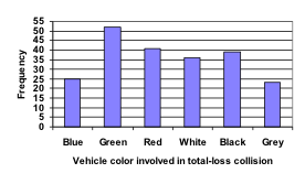 Notice that the height of each bar is determined by the frequency of the corresponding color. The horizontal gridlines are a nice touch, but not necessary. In practice, you will find it useful to draw bar graphs using graph paper, so the gridlines will already be in place, or using technology. Instead of gridlines, we might also list the frequencies at the top of each bar, like this:
 The following video explains the process and value of moving data from a table to a bar graph.
https://youtu.be/vwxKf_O3ui0
The following video explains the process and value of moving data from a table to a bar graph.
https://youtu.be/vwxKf_O3ui0
Pareto chart
A Pareto chart is a bar graph ordered from highest to lowest frequencyExample
Transforming our bar graph from earlier into a Pareto chart, we get: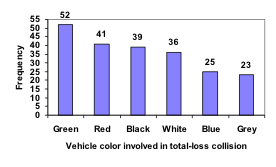 The following video addresses this example of building a Pareto chart.
https://youtu.be/Tsvru8DPxBE
The following video addresses this example of building a Pareto chart.
https://youtu.be/Tsvru8DPxBE
Example
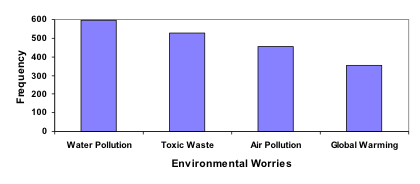
In a survey[footnote]Gallup Poll. March 5-8, 2009. http://www.pollingreport.com/enviro.htm[/footnote], adults were asked whether they personally worried about a variety of environmental concerns. The numbers (out of 1012 surveyed) who indicated that they worried “a great deal” about some selected concerns are summarized below. Construct a Pareto chart from the following frequency table.| Environmental Issue | Frequency |
| Pollution of drinking water | 597 |
| Contamination of soil and water by toxic waste | 526 |
| Air pollution | 455 |
| Global warming | 354 |
Answer:
The bar graph shown below is ordered from highest to lowest frequency and is, therefore, also a Pareto chart.
Pie Chart
A pie chart is a circle with wedges cut of varying sizes marked out like slices of pie or pizza. The relative sizes of the wedges correspond to the relative frequencies of the categories.Recall percents
In the pie chart examples that follow, you'll need to be able to find percents from proportions as well as the percentage of a number. Example 1: Find a percent given a part and a whole.12 of 35 students are majoring in mass communications. Write this as a percent.
[latex]\dfrac{12}{35}\approx 0.343 = 34.3\%[/latex]
Example 2: Find the percentage of a whole.What is 16% of 12,500? To find this number, you can translate the words into the equation: [latex]x=0.16\cdot12,500[/latex]; Find [latex]x[/latex].
Solving for [latex]x[/latex], we find that [latex]x = 2000[/latex].
example
Once again, let's consider our vehicle color data.| Color | Frequency |
| Blue | 25 |
| Green | 52 |
| Red | 41 |
| White | 36 |
| Black | 39 |
| Grey | 23 |
| Color | Frequency | Relative Frequency |
| Blue | 25 | [latex]\frac{25}{216}=11.57\%[/latex] |
| Green | 52 | [latex]\frac{52}{216}=24.07\%[/latex] |
| Red | 41 | [latex]\frac{41}{216}=18.98\%[/latex] |
| White | 36 | [latex]\frac{36}{216}=16.67\%[/latex] |
| Black | 39 | [latex]\frac{39}{216}=18.06\%[/latex] |
| Grey | 23 | [latex]\frac{23}{216}=10.65\%[/latex] |
 This video demonstrates how to create pie charts like the one above.
https://youtu.be/__1f8dKh6yo
This video demonstrates how to create pie charts like the one above.
https://youtu.be/__1f8dKh6yo
Example
Create a bar graph and a pie chart to illustrate the grades on a history exam below. A: 12 students, B: 19 students, C: 14 students, D: 4 students, F: 5 studentsAnswer:
The following bar graph and pie chart illustrate the data described.


Example
In this example, we consider how to read a pie chart. The pie chart below shows the percentage of voters supporting each of three candidates running for a local senate seat. If there are 20,000 voters in the district, approximately how many support Reeves?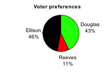
Answer: The pie chart shows that about 11% of the 20,000 voters in the district support Reeves. To calculate the number of voters supporting Reeves, we compute [latex]0.11\cdot20,000\approxeq2200[/latex]. So approximately [latex]2200[/latex] voters support Reeves.
The following video works through this example. https://youtu.be/mwa8vQnGr3ITry It
[ohm_question]1059[/ohm_question]Pictogram
A pictogram is a statistical graphic in which the size of the picture is intended to represent the frequencies or sizes of the values being represented.Exercises
College students surveyed at Mountain Range University averaged 8.5 hours a day on technology: 5.5 hours of these hours were spent playing video games or on social media and 3 hours, on average, doing school work. The survey results can be represented by the following pictogram.
Caution! When Visualizations are Misleading
While the intention behind creating visualizations for data is typically to make it quicker and easier to absorb information, it is also possible to create visuals that distort and misrepresent the data. In the next examples, we consider several potentially misleading visuals.examples
Example 1: In this first example, the bar graph shown is a 3-dimensional attempt at something fancy and the distortion is likely unintentional. Sometimes people will add features to graphs that don’t help to convey their information. Three-dimensional graphs like this one are usually not as effective as their two-dimensional counterparts.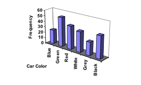 Example 2: A labor union might produce the graph below to illustrate the difference between the average manager salary and the average worker salary.
 Looking at the picture, it would be reasonable to guess that the manager salaries is 4 times as large as the worker salaries – the area of the bag looks about 4 times as large. However, the manager salaries are in fact only twice as large as worker salaries, which were reflected in the picture by making the manager bag twice as tall.
The following video reviews the two examples of ineffective data representation in more detail.
https://youtu.be/bFwTZNGNLKs
Looking at the picture, it would be reasonable to guess that the manager salaries is 4 times as large as the worker salaries – the area of the bag looks about 4 times as large. However, the manager salaries are in fact only twice as large as worker salaries, which were reflected in the picture by making the manager bag twice as tall.
The following video reviews the two examples of ineffective data representation in more detail.
https://youtu.be/bFwTZNGNLKs
example
Compare the two graphs below showing support for same-sex marriage rights from a poll taken in December 2008[footnote]CNN/Opinion Research Corporation Poll. Dec 19-21, 2008, from http://www.pollingreport.com/civil.htm[/footnote]. The difference in the vertical scale on the first graph suggests a different story than the true differences in percentages, making it appear as if, in 2008, three times as many people opposed same-sex marriage rights as supported it.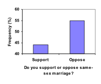 Vertical Axis is skewed (starting at 40 instead of at 0)
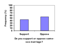 Here, the vertical axis starts at 0 and gives a more accurate representation of the frequencies.
Licenses & Attributions
CC licensed content, Original
- Revision and Adaptation. Provided by: Lumen Learning License: CC BY: Attribution.
CC licensed content, Shared previously
- Presenting Categorical Data Graphically. Authored by: David Lippman. Located at: http://www.opentextbookstore.com/mathinsociety/. License: CC BY-SA: Attribution-ShareAlike.
- Bar graphs for categorical data. Authored by: OCLPhase2's channel. License: CC BY: Attribution.
- Pareto Chart. Authored by: OCLPhase2's channel. License: CC BY: Attribution.
- Creating a pie chart. Authored by: OCLPhase2's channel. License: CC BY: Attribution.
- Reading a pie chart. Authored by: OCLPhase2's channel. License: CC BY: Attribution.
- Bad graphical represenations of data. Authored by: OCLPhase2's channel. License: CC BY: Attribution.
